
The right choice of colours can drastically change the way a condo unit looks and feels. Your condo unit may be small in terms of floor space but with a good choice of colours, you can make it look and feel much bigger.
Condo interior design in Singapore has a high regard for colour schemes since they can help compensate for the limitations of a small space. With the right choice of colours, you are able to turn any small space into a cosy one.
So what colour combinations should you look at for your condo? Here are a few highly recommended options:
- Red, grey, and white
Red, grey, and white are colours that represent contemporary interior design. These solid shades are usually found in upper-class and even luxury style apartments thanks to their ability to exude elegance in the room.
Apart from their aesthetic value, this trio of shades is also perfect for small condo units because:
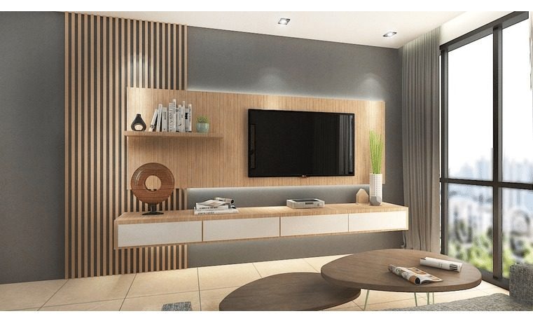
- White and grey can make the room look more spacious. Whitewashed walls illuminate the floor space both day and night. Grey floors make the overall condo area seem wider and bigger, in the same manner as the roads outdoors.
- Red offers a pop of colour to the otherwise rigid and modern white and grey hues. Red, especially in its rich shades (ranging from crimson to burgundy), breaks the monotony between hues. It also gives the home a more playful vibe but not at the expense of the scheme’s high fashion appeal.
- Grey, turquoise, and black
If you are into retro-modern glam, grey, turquoise, and black are the colours to go for.
Grey and black are proponents of minimalist interiors. You can use grey as a floor shade to maintain its linkage to nature (earth), while black can be used as an accent colour for railings and handles.
Turquoise on the other hand can be used both as a wall colour and an accent. It is a cool complement to black, and a brighter partner to grey, without being flamboyant. It is likewise a cool shade that works well with different colours especially when you are to match it with furniture pieces and light sources.
This colour set also helps conceal dust and residue. Unlike white and pastels, grey spots due to dust and other stains can be kept hidden from the eyes, making the overall home look low-maintenance.
- Grey, yellow, and white
Lastly, there’s grey, yellow, and white. Contrary to grey, turquoise, and black, this colour scheme offers a louder, more vocal take on the minimalist approach to interior design.
Condo interior design in Singapore makes use of these colours particularly on rooms where the greatest number of people hang out. These include the living room and the dining room, and sometimes, the bedroom.
These colours help illuminate the home since they reflect the light that hits their surfaces. Yellow, in particular, not only creates a pop of colour into the home but also helps brighten up specific areas of the house.
Making the most out of your chosen colour scheme
While these colour schemes breathe life into your condo, there are also many other ways to maximise their features. For instance, you can open the windows for sunshine to enter, so that your condo further brightens up as the sunlight hits the white and yellow walls.
In addition, you can also match turquoise with other complementary shades through your chosen accessories. For instance, a lemon-yellow couch will match a turquoise wall just right. Indoor plants can also soften the stark brightness of red in a white and grey palette, allowing you to feel more at home with your hues.